How to Use the Opportunity Score to Prioritize Your JTBD Product Roadmap
...Or Maybe Not: A Critical Look at a Popular Prioritization Tool
You've heard about the Opportunity Score. It's a popular metric used to identify and prioritize customer needs, and display them on a scatter-plot, promising to guide your product roadmap with data-driven precision.
The premise is enticing: uncover unmet needs, quantify their importance, and focus your efforts where they'll have the biggest impact.
But does the Opportunity Score live up to the hype?
This article will delve into the mechanics of the Opportunity Score, show you how it's calculated, and then reveal some critical flaws that could be leading you astray. We'll also explore more reliable approaches to prioritizing your strategic product roadmap based on real customer needs, including a modified Rank-Sum approach and a method I call Percentages and Ranks, both adapted to utilize a 1-100 prioritization scale derived from traditional 1-5 importance and satisfaction ratings (although I prefer effort over satisfaction).
Step 1:
Make Your Data Accessible
Before we dive into prioritization methods, it's crucial that your data is readily available and easy to work with. You might have your data locked away in a format that makes analysis difficult and time-consuming. Don't let that be a barrier to insights.
Action: Extract, transform, and load (ETL) your data into tools you're comfortable with, such as Excel Pivot Tables or data visualization software like Tableau or Power BI. This will enable you to:
Create Crosstabs: Understand the relationships between different customer needs and target groups (segments).
Explore Freely: Ask new questions of the data and quickly test hypotheses.
Visualize: Create charts and dashboards for a clearer understanding of the landscape.
Step 2:
Understanding (and Misunderstanding) the Opportunity Score
Note: I’m heading into the area of data science. The following observations are derived from critiques performed by several real statistician/data scientists and survey gurus (not me).
The Opportunity Score is often presented as a straightforward way to quantify unmet customer needs. Here's how it typically works:
Data Collection: Customers rate the importance and their current satisfaction for each desired outcome (need). This is usually done with a 1-5 scale.
Scoring: Importance and satisfaction scores are calculated, using Top 2 Box percentages (e.g., the percentage of respondents who rated an outcome as a 4 or 5 on a 5-point scale).
Opportunity Algorithm: The Opportunity Score is then calculated using the following formula (the inputs are Top 2 Box percentages converted into factors by magic - I mean by moving the decimal place to the right 1 spot).
For example: if 55% of the (filtered or unfiltered) respondents rate an outcome as 4 or 5, the factor used in the following formula would 5.5
Importance: Very (4) or Extremely Important (5), e.g., 5.5 = 55% of respondents
Satisfaction: Very (4) or Extremely Satisfied (5), e.g., 1.0 = 10% of respondents
Opportunity Score = Importance Score + max(Importance Score - Satisfaction Score, 0)
This formula essentially gives extra weight to importance, adding the difference between importance and satisfaction only when importance is greater than satisfaction.
At first glance, this might seem logical. Higher importance and lower satisfaction should indicate a greater opportunity, right?
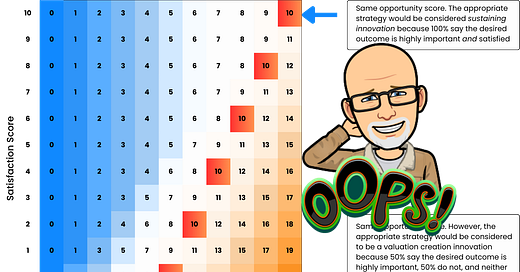
Here are some example scores that can result in a 10. Remember, these are factors that indicate what % of the respondents rated:
Here are some that can result in scores > 10
A closer examination reveals four significant problems.
Problem #1:
The Opportunity Algorithm is Biased
Imagine each customer casting a vote on whether a need is underserved. The Opportunity Score, by using Top 2 Box and double-weighing importance, effectively allows some customers to vote three times while others don't get a vote at all. This built-in bias skews the results and can misrepresent the true landscape of unmet needs.
Problem #2:
The Opportunity Algorithm Incorrectly Prioritizes Underserved Needs
The common interpretation is that an Opportunity Score above 10 signifies an "underserved" need and therefore a high-priority opportunity. However, this is misleading.
Consider this scenario:
Desired Outcome A: Opportunity Score 12, Underserved (Important but not Satisfied) 20%
Let me explain. In this first scenario, 100% of the population stated that the desired outcome was very or extremely important. However, since the satisfaction factor is 8, that means that 20% (or 2) of those respondents stated that they were unsatisfied. Therefore only 20% are underserved to some degree or another.
Desired Outcome B: Opportunity Score 10, Underserved (Important but not Satisfied) 50%
The score of 10 means it’s less important than 12, right? The response I’ve typically heard to this is that this isn’t about ranking the top 10 needs, it’s about whether they’re in the top 10. Is that helpful? Because you can just address all of them, right?
Let me explain scenario B. In this second scenario, 100% of the population stated that the desired outcome was not very or extremely satisfied. 50% of those people stated that it was very or extremely important
According to the Opportunity Score, Outcome A is a higher priority. But Outcome B has a significantly higher percentage of customers who find it important but are not satisfied, i.e., 50% > 20%. This highlights a fundamental flaw:
The Opportunity Score can prioritize outcomes with fewer underserved customers over those with more.
Which metric do you think is a better predictor of a true opportunity: the Opportunity Score or the actual percentage of underserved customers?
When we examine the range of possible importance, satisfaction, and opportunity scores, we can more clearly see the Opportunity Score increases the risk of confounding the innovation strategy because it considers desired outcomes as equally underserved when in fact they are not. The Opportunity Score formula can mislead you into thinking that needs are equally underserved when they are not.
This becomes even more bewildering when we attempt to theme metrics together to find actionable initiatives or fit these into a four quadrant strategy matrix of your choice. It’s more complicated than that in the absence of a straightforward prioritization — or ranking.
However, I’ll show a couple of ways to simplify and rank outcomes - with much more precision - down below.
Problem #3:
The Opportunity Algorithm Amplifies Statistical Error
Any robust data analysis should acknowledge and report the margin of error. Uncertainty is inherent in sampling, and good product managers need to understand how this affects their decisions.
The Opportunity Score is particularly susceptible to this problem because it's impacted by sampling error three times:
Twice for the importance score
Once for the satisfaction score
With a small sample size (e.g., 30), the Opportunity Score could be off by as much as ±5.4 in the worst-case scenario (that means if it scores as 10, the actual score could range from 4.6 to 15.4). This means that sampling error alone could lead to misclassifying opportunities and prioritizing the wrong needs. While absolute certainty is often unattainable, metrics that amplify uncertainty are counterproductive.
How can you tell if the score is spot on, on the bottom of the range, or at the top of the range? Seems like a lot of guess-work to me. And we’re supposed to be in the business of knowing.
So, if your survey budget is small, you get penalized even more.
Are you still surprised I’m saying all of this?
Problem #4:
The Opportunity Score is Difficult to Interpret
When it comes to making and communicating strategic decisions, clarity is paramount. You need metrics and visualizations that are easy to understand and explain to your stakeholders. The Opportunity Score falls short in this regard.
All they see are dots on a plot.
It’s almost like it’s in a foreign language 🤔
Its interpretation requires acknowledging and compensating for the multiple issues outlined above. Its meaning is not intuitive and requires a lengthy explanation – hardly ideal for quick, informed decision-making.
I’ve come to believe that it’s no longer worth trying to explain, and do not use it for any sort of roadmap prioritization. Having said that, I’m not throwing the baby out with the bath water. Jobs-to-be-Done does not depend on any particular formulas or algorithms.
Beyond the Opportunity Score:
Better Ways to Prioritize
Let's explore two alternative approaches. These will often give you a completely different set of priorities than the Opportunity Score.
Forcing them into a scale like this (1-100) exposes the distance between ranks. This can be important when you’re comparing needs-based segments against each other, or other data cuts.
I’ll leave it up to you to decide whether over- or under-stating opportunity is something that should concern you. 😉
PAYWALL REMOVED!!!
Option 1: Modified Rank-Sum Approach
This approach adapts the concept of rank sums to create a 1-100 prioritization scale, where 1 represents the highest priority and 100 the lowest.
Yes, these calculations can be dynamically recalculated based on the data cut you wish to apply in your favorite analytics platform. Polish up your DAX formula writing 🤣. Or check out my Masterclass where you can cheat.
How it Works:
Data Collection: Collect data where customers rate multiple needs on a 1-5 scale for both importance and satisfaction.
Calculate the Difference: For each need, for each customer, calculate the difference between the importance and satisfaction ratings (Importance - Satisfaction).
Rank the Differences: For each need, rank the difference scores across all customers from highest to lowest.
Sum the Ranks: For each need, calculate the sum of the ranks.
Convert to 1-100 Scale: This is where we adapt the rank-sum concept. We'll transform the summed ranks into a 1-100 scale using the following logic:
Highest Summed Rank: The need with the highest summed rank (indicating the most consistently low difference scores, meaning low priority) will be assigned a score of 100.
Lowest Summed Rank: The need with the lowest summed rank (indicating the most consistently high difference scores, meaning high priority) will be assigned a score of 1.
Middle Ground: Needs with summed ranks that fall in the middle will be assigned a score around 50.
Linear Interpolation: To achieve this, we can use a simple linear transformation. Let
min_rank
be the lowest summed rank,max_rank
be the highest summed rank, andcurrent_rank
be the summed rank of a given need. The 1-100 score can be calculated as:1-100 Score = 1 + ( (max_rank - current_rank) / (max_rank - min_rank) ) * 99
Example:
Let's say we have 5 needs (A, B, C, D, E) and 10 customers. After calculating differences, ranking them, and summing the ranks, we get:
min_rank
= 15max_rank
= 55
Now, let's calculate the 1-100 scores:
Need A: 1 + ((55 - 15) / (55 - 15)) * 99 = 1 + (40/40) * 99 = 1 + 99 = 100
Need B: 1 + ((55 - 40) / (55 - 15)) * 99 = 1 + (15/40) * 99 = 1 + 37.125 = 38.125
Need C: 1 + ((55 - 25) / (55 - 15)) * 99 = 1 + (30/40) * 99 = 1 + 74.25 = 75.25
Need D: 1 + ((55 - 55) / (55 - 15)) * 99 = 1 + (0/40) * 99 = 1 + 0 = 1
Need E: 1 + ((55 - 30) / (55 - 15)) * 99 = 1 + (25/40) * 99 = 1 + 61.875 = 62.875
In this example, Need D is the highest priority (score of 1), and Need A is the lowest priority (score of 100).
Option 2: Percentages and Ranks
This method focuses on leveraging individual customer rankings to create intuitive and actionable metrics, then converts those into a 1-100 prioritization scale.
How it Works:
Rank Needs for Each Participant: For each customer, rank their needs from most to least underserved based on the difference between importance and satisfaction ratings (using the 1-5 scale). The need with the largest positive difference is ranked highest.
Define "Underserved" and "Overserved": Set thresholds for the difference between importance and satisfaction ratings to categorize needs as underserved or overserved (e.g., a difference of 2 or greater is considered underserved).
Count Underserved/Overserved: Calculate the percentage of participants for whom each need was underserved or overserved.
Define "Top" and "Bottom" Priority: Determine how many of the top/bottom ranked needs for each participant constitute their "top" or "bottom" priorities (e.g., the top 2 needs).
Count Top/Bottom Priority: Calculate the percentage of participants for whom each need was a top or bottom priority.
Convert to 1-100 Scale: We'll use a weighted average of the percentages (Underserved and Top Priority being most important) and then linearly transform that average to a 1-100 scale, similar to the method above.
Example:
Let's say we have 5 needs (A, B, C, D, E) and after steps 1-5, we have these percentages:
Now, let's create a weighted average, giving more weight to "Underserved" and "Top Priority":
Weighting: Let's say we use the following weights:
% Underserved: 0.5
% Top Priority: 0.3
% Overserved: -0.1 (Negative weight since it's the opposite of priority)
% Bottom Priority: -0.1 (Negative weight)
Calculate Weighted Average:
Convert to 1-100 Scale:
min_avg
= -4.5max_avg
= 51.5
In this example, Need C is the highest priority (score of 1), and Need D is the lowest priority (score of 100).


Decision-Making Table: Choosing the Right Approach
Recommendations:
If you need a method that leverages the concept of rank sums while still using 1-5 ratings and provides a 1-100 prioritization scale, the Modified Rank-Sum is a good option. It offers a balance between statistical rigor and practicality.
If you prioritize ease of understanding, transparency, and actionable insights, the Percentages and Ranks method is generally preferred. It's easier to implement, communicate, and doesn't require advanced statistical expertise. The 1-100 scale derived from the weighted percentages provides a clear prioritization framework.
Avoid the Opportunity Score. Its flaws outweigh its benefits, and it's likely to lead to inaccurate conclusions and misdirected product development efforts.
Conclusion
The Opportunity Score, though popular, is flawed due to its complexity, biases, and error-prone nature. Alternatives like the Modified Rank-Sum and Percentages and Ranks methods, both leveraging a dynamic (context aware) 1-100 prioritization scale, offer greater reliability and insight.
By weighing the strengths of each method and understanding the derivation of the 1-100 scale, you can make informed, data-driven decisions that truly align with customer priorities. Avoid the pitfalls of the Opportunity Score’s complexity—opt for clarity, accuracy, and actionable insights to prioritize your product roadmap effectively.
No, this isn’t the Jobs-to-be-Done you hear about with switch interviews and whiteboard exercises. This is meant to be serious and provide an evidence-based approach to making transformational financial investment decisions for your Enterprise.
Would you like to have all of the DAX formulas that drive these ranking concepts?
This is not an attack on the Opportunity Score; it has served a useful purpose for decades. The Job lens itself is a game-changer for innovation research. But as we always ask our clients to do, sometimes we have to take what we learn in the real world, and evolve our approach to solve for problems that have surfaced through our work, and apply our newly acquired learnings...
…to get the job done in a new and different way. Better.
What many of us (you know who you are) have found is that our stakeholders need an approach that is easier to comprehend and lends itself to actual prioritization of efforts. While this article may seem overwhelming, the end result will be a much simpler, and actionable, set of data.
Remember: The executives that sponsor our work need to take action NOW, and do so with confidence.
If you’d like to learn more, you can check out my courses on my website. If you already know that you’d like to accelerate the front-end of innovation using AI, here’s a link to my JTBD Masterclass.
If you just want help figuring out what your next strategic move should be, my colleagues and I are here to help. And if you’re concerned about the high project fees of the past, let’s talk. Not only is our work more accurate, you’ll get more insights in less time, and for smaller investment than you’ve ever seen before. Call me.
Mike Boysen - www.pjtbd.com Why fail fast when you can succeed the first time?
Book an appointment: https://pjtbd.com/book-mike
Grab my JTBD Masterclass: https://mc.zeropivot.us/s/mc-1
Get the whole customer management thing done on a single platform: https://pjtbd.com/tech-stack
This is a lot of technical stuff, which probably turns off a large crowd. But, this is how you get to the answer to a question like:
"What are the top 3 things I can start doing next week that will have the most impact?"
If we can "appliance-ize" this process, everyone will use this to solve problems - I predict.